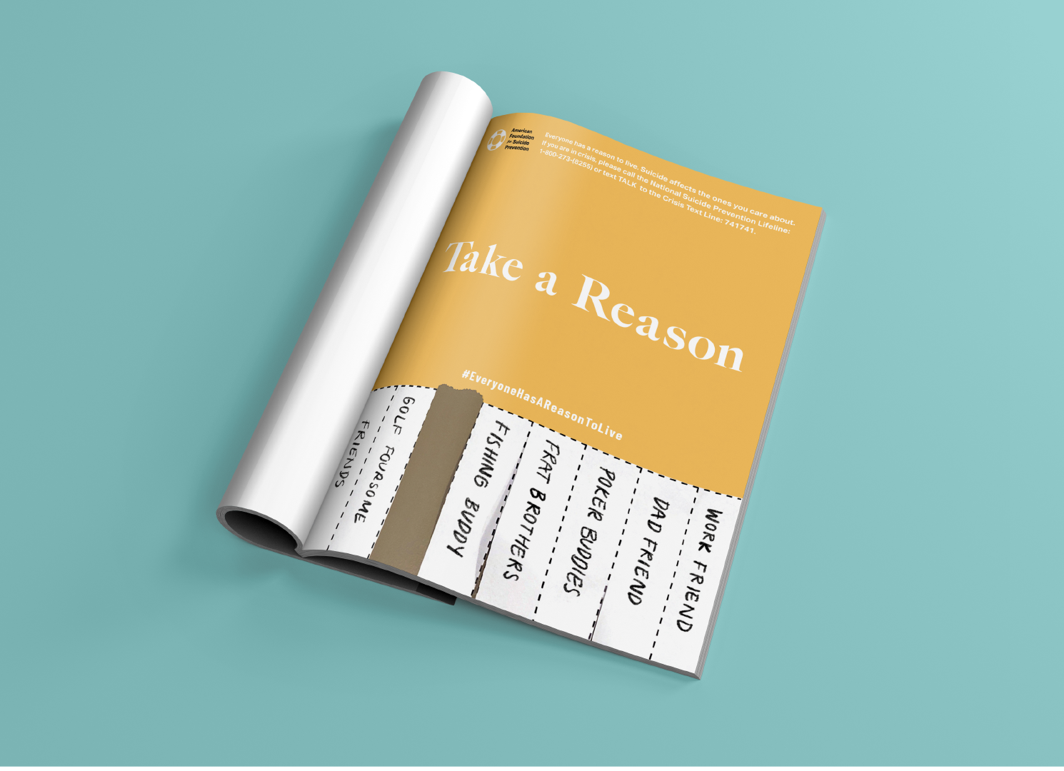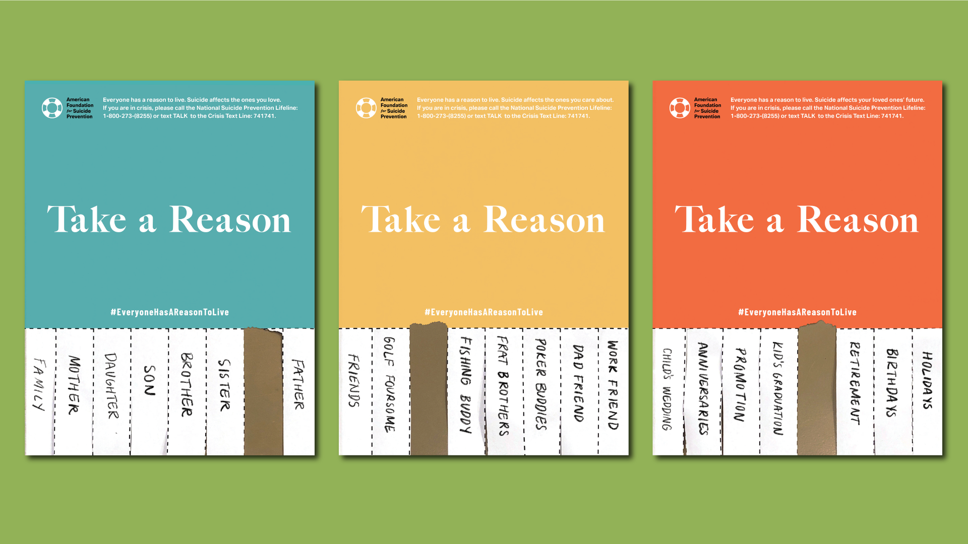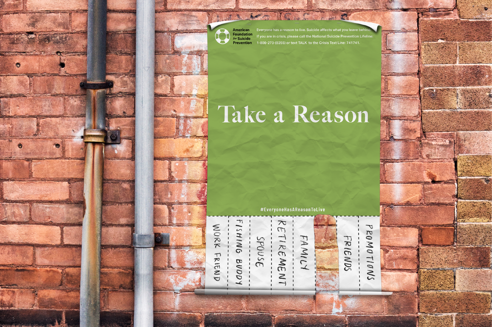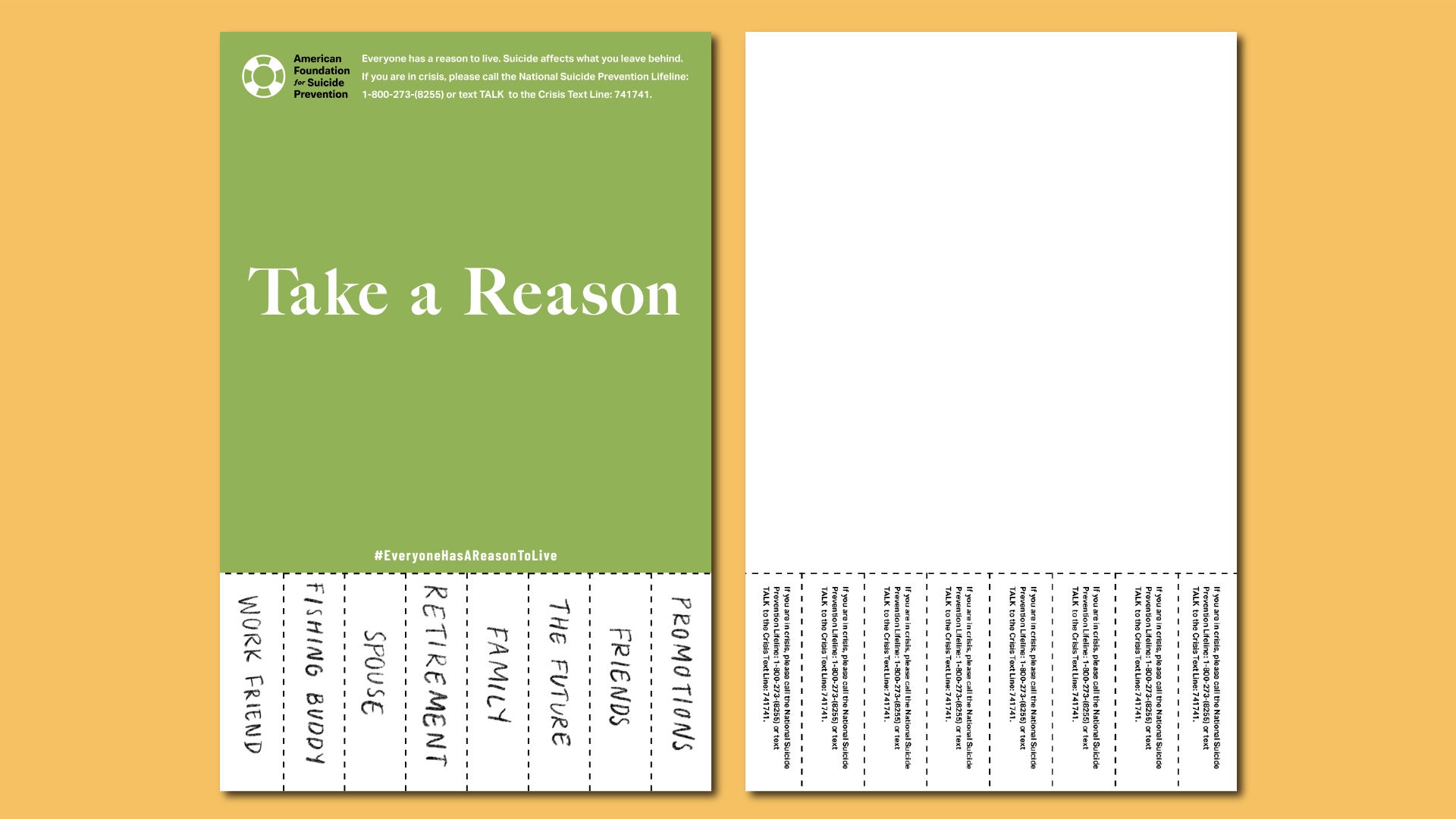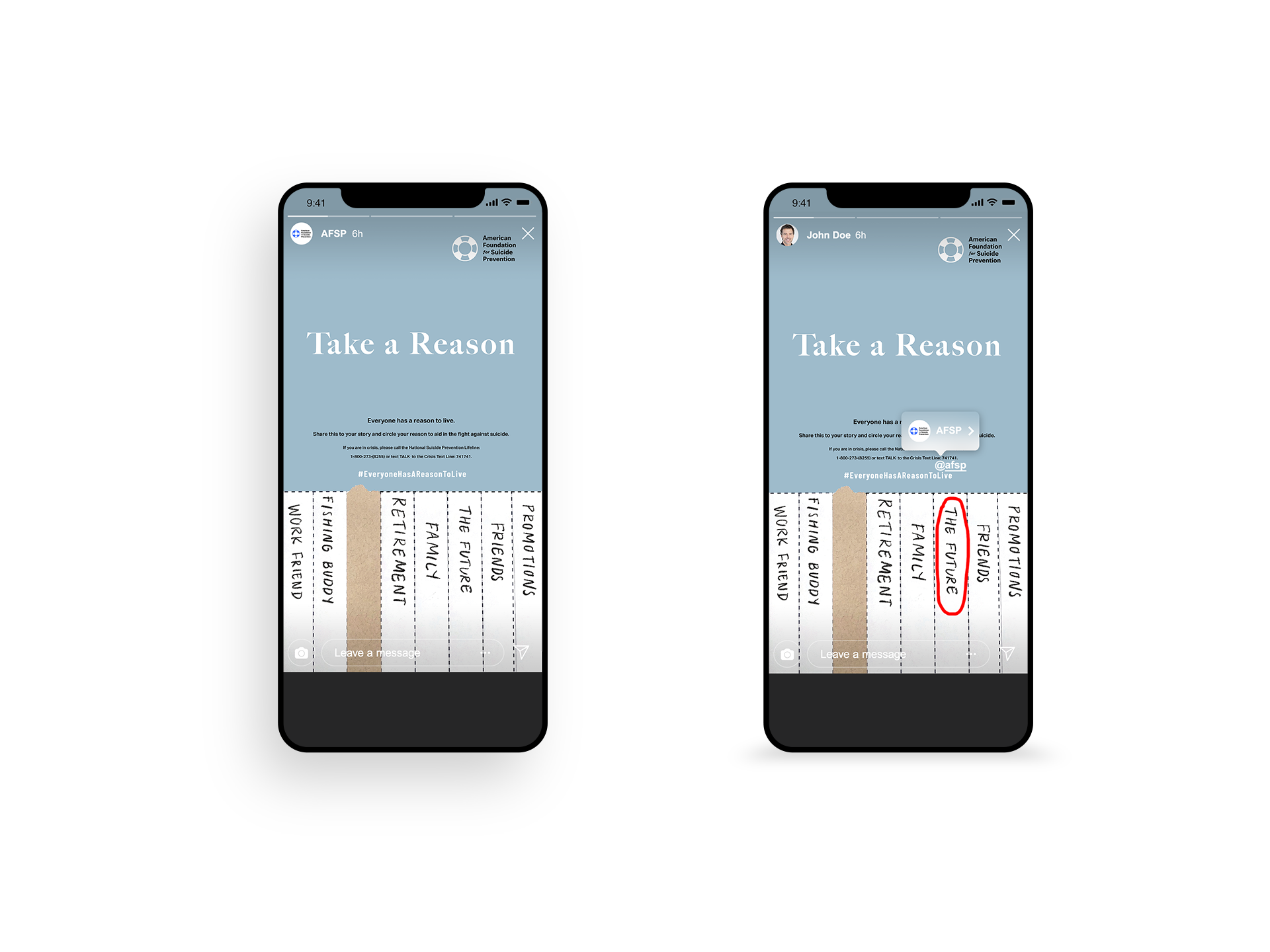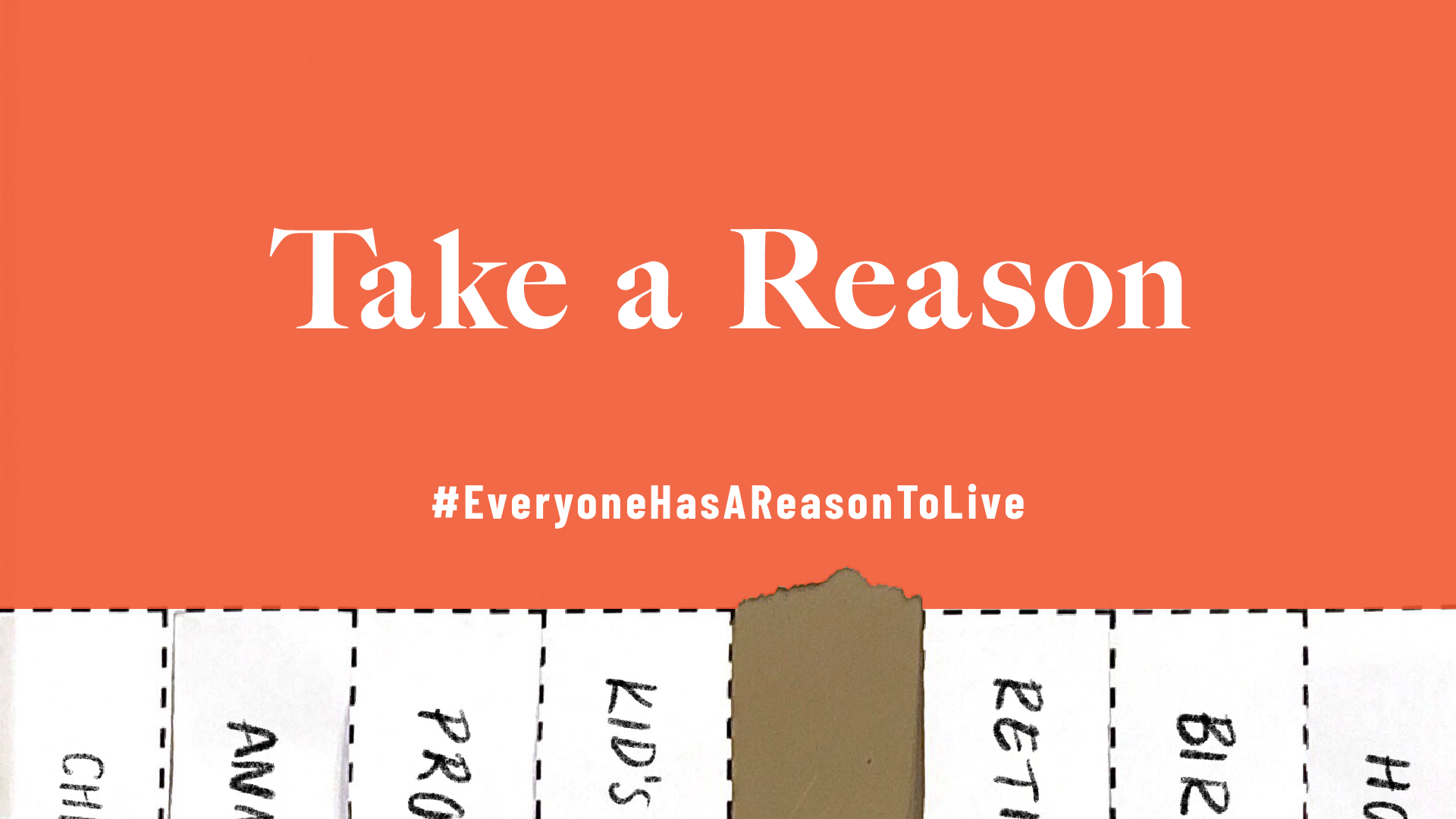
The American Foundation for Suicide Prevention is an organization focused on preventing suicide. According to their website, “White males accounted for 69.67% of suicide deaths in 2017.” The ads in this campaign are geared toward that demographic. In order to communicate with that specific audience, warm colors, such as muted blue and green, orange, and yellow, and friendly type are used. The components of this campaign use a common trope seen in busy streets: a tear-away poster. This allows users to take a part of the poster, therefore giving them a physical reason they can hang on to. The handwriting was implemented because it makes the campaign more personable and familiar; thus enforcing the idea that the brand is friendly and a shoulder to lean on. The campaign is implemented through print ads as well as digital ads because many middle-aged men use social media but still read magazines so it would be impactful for them to see the ads in both places. The campaign allows the audience to feel comforted and understood, thus encouraging suicide prevention.